It is no secret that conversion rate is an art, and the conversion tactics that work for your company or brand will vary, depending on your service and customers. Conversion Rate Optimisation is a long, never ending journey. In fact, you should never stop until every visitor converts ;) Of course, that could never happen, even with the purest traffic source, but we could try and get as close as we can.
Conversion primarily works when you make changes based on feedback and deep insights from your target market, but there are essentials you should have in place as a ‘baseline’ when designing or redesigning your website. Whether you have a brochure site or a fully fledged Ecommerce store, you will find most, if not all of the points in this conversion rate checklist useful.
1. Social Proof
a) Do you have your clienteles logos on your site?
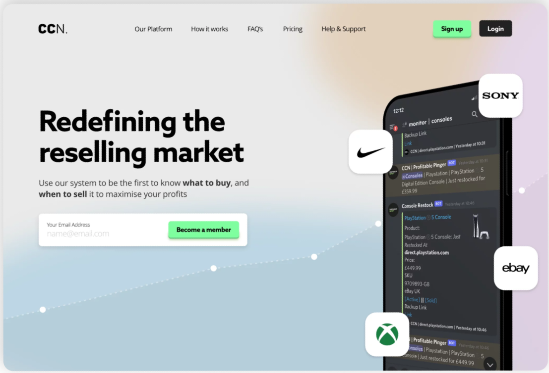
Having logos of some of the businesses, companies, or people you have worked with works wonders for social proof.
b) Do you have testimonials listed on your site?
Either on a separate page or on a section of your homepage, this works really well and instills trust into visitors. Collecting and asking for testimonials should be a regular practice.
c) Do you have social network links on the site?
Having social network links to your Facebook & Twitter help with social proof and conversion. Even better if you could incorporate your latest tweets in your design, or show your Facebook ‘likes’.
2. Trust
a) Do you have your accreditation's, awards, and group logos on your site?
Any accreditation's you have should be on your website. Anywhere you have been featured such as television, high profile online blogs, or national newspapers should also be mentioned and on the site.
b) Is your site Secure? (Important for shopping carts & checkouts)
Having secure members areas and payment gateways is essential. Purchasing a McAfee or Verisign verification badge can do wonders for trust on your site.
3. USP’s and Selling Points
a) Do you offer a free trial on your site?
Free trials are great for membership services or high ticket items where a smaller ‘sample’ can be trialled for free. You must measure the cost of the free trials against the increase in orders and decide if it is worth it, but in general free trials work great!
b) Do you offer a guarantee for your service?
A guarantee seals the deal. It makes the consumer feel safe and confident in the product and your brand and will secure a lot more sales. The guarantee can be a 30 day money back guarantee, or you could even go crazy and offer them double the money back, or lifetime guarantee. Usually you won't find people abusing the guarantee, and even if you do find the odd one or two, it will be worth it because of the increase in orders.
c) Unique Selling Points... why you?
Clearly displayed on the homepage of the website must be a reason, or reasons why people should choose you for a particular service. Is it the cheapest? Is it easy to order? Is it the fastest? Most powerful? Does it save the most time?
4. The Other Stuff.
a) Live Chat installed on the site?
A live chat function such as Olark could really influence visitors to talk to you and you may even close a sale. Just by having a live chat personally I think you are increasing trust in the site, knowing that there’s someone to talk to, just in case you need some help.
b) Feedback collection
You could gather feedback using a widget or gather it at the end of an order. The important thing is, you are gathering feedback from day 1 so you can constantly improve. I believe again, a feedback form itself can increase trust, because it lets the consumers know you do care about your performance.
c) Visible Phone Numbers & Contact Forms
Is it easy to contact you. Do you offer multiple ways of contact? Is the contact only ever one click away no matter what page you are on?
d) Create a “Colourful” About Us Page
Having a good about us page is always an important thing for me. It shows a bit of ‘human-ness’ in the site, and further helps trust and confidence in your brand. By Colourful though I don’t mean actual different colours... I just mean that the about us page should have a bit of your personality in it. If you are a quirky company, show it. If you’re professional, project that.


